Obsidian’s graph view is the screenshot everyone shares: hundreds of dots, threads between them, a slowly settling constellation of everything you’ve written. It’s also the feature many people stop opening after the first week.
Both reactions are fair. The graph is genuinely good at a few things and genuinely bad at others. This article goes through what it’s for, how to set it up so it earns its place, where it runs out, and what else you can use to see a vault — including, at the end, the tool we make.
What the graph view is
The graph view is a core plugin. Every note is a node, and every internal link between two notes is an edge. The layout is a physics simulation: linked notes pull towards each other, all notes push each other apart, and the picture settles into clusters.
It comes in two forms:
- The global graph shows the whole vault.
- The local graph shows only the note you have open and its neighbours, out to a depth you choose.
Most of the frustration people have is with the first; most of the value is in the second.
What it’s good for
Seeing the shape of a vault at a glance
Even an unreadable global graph tells you something. Dense clusters are topics you’ve written a lot about. A few big nodes with many links are your hubs — index notes, maps of content, daily notes. A scattering of unconnected dots around the edge is the list of notes nothing points to.
Finding orphans
Turn on Orphans in the filters and look at the dots floating alone. Each one is a note that no other note links to. Some are fine on their own; many are notes you’ll never find again unless you link them to something. Going through orphans is one of the best ten-minute vault-maintenance jobs there is.
Working locally
The local graph, docked in a side panel at depth one or two, is a practical tool. As you move from note to note it shows what the current note touches and what’s one step further. It’s a good way to notice a related note you’d forgotten while you’re writing.
Colour by meaning
Groups let you colour nodes by a search query — a folder, a tag, a word in the path. Colouring, say, your project notes red and your reading notes blue turns an anonymous cloud into a map you can read. This is the single setting that makes the biggest difference.
Settings that help
A few adjustments make the graph far more useful:
- Filters → Existing files only. Hides links to notes that don’t exist yet, which otherwise appear as extra dots.
- Filters → Tags and Attachments off, unless you specifically want them; they add a lot of noise.
- Groups for your main areas, as above.
- Display → Text fade threshold. Show labels only when you zoom in, so the zoomed-out view stays readable.
- Forces. Raise Repel force and Link distance to pull clusters apart; lower Center force if everything collapses into a ball.
- Display → Animate replays the vault growing in the order notes were created. Not useful every day, but a nice way to see how your thinking moved.
Where it falls short
The hairball
Past a few hundred notes the global graph tends to become a dense ball where everything seems connected to everything. Daily notes and index notes, which link to many others, pull the picture into a knot. You can filter them out, but then you’re tuning the graph instead of reading your notes.
Positions mean nothing, and don’t stay
Because the layout is a simulation, a note’s position is a by-product of the forces, not a decision anyone made. Add a few links and the picture shifts. You can’t build up a sense of where a note lives, the way you know where things are in a room, because there is no stable where. (Why that matters for rereading is covered in Why you never reread your notes.)
All links look the same
An edge says that one note mentions another — not why. A link to a source, a link to a counter-argument and a passing mention all draw the same grey line. The graph shows that a connection exists, but not what kind it is.
It shows structure, not content
You can’t read anything in the graph. It’s a picture of your links, and links are only as good as the habit behind them. A vault with few deliberate links produces an uninformative graph however you style it. (There’s more on linking on purpose in How to take notes you’ll actually come back to.)
It can get heavy
In our experience a large vault with everything shown can make the global graph sluggish, especially on modest hardware. Filtering helps; so does preferring the local graph.
Alternatives inside Obsidian
None of these replaces the graph outright; each fixes one of its weaknesses.
Canvas
Canvas is a core plugin: an infinite board where you place notes, cards and images by hand and draw arrows between them. Because you decide where things go, positions mean something and they stay put. The trade-off is that it’s manual — a canvas shows the notes you put on it, not your whole vault. Canvas files use JSON Canvas, an open format Obsidian published, so other tools can read and write them.
ExcaliBrain
ExcaliBrain, a community plugin by the author of the Excalidraw plugin, draws a structured view around the current note: parents above, children below, related notes to the side. You define those relationships with fields in your notes, which answers the “all links look the same” problem — at the price of maintaining the fields.
Juggl and other graph plugins
Juggl offers a more configurable graph with styling and layouts you can control. Community plugins come and go, so check that any graph plugin is maintained for your version of Obsidian before building a habit on it.
Maps of content
The lowest-tech alternative is a note: a hand-written index that links to the notes on a topic, in an order that makes sense to you, with a sentence about each. A map of content is less pretty than a graph, but it says why notes belong together — which the graph can’t.
A different idea: walk through it
Here is where we should say plainly that we make Aloha, and that it’s a different answer to the same question: how do I see my vault, and come back to what’s in it?
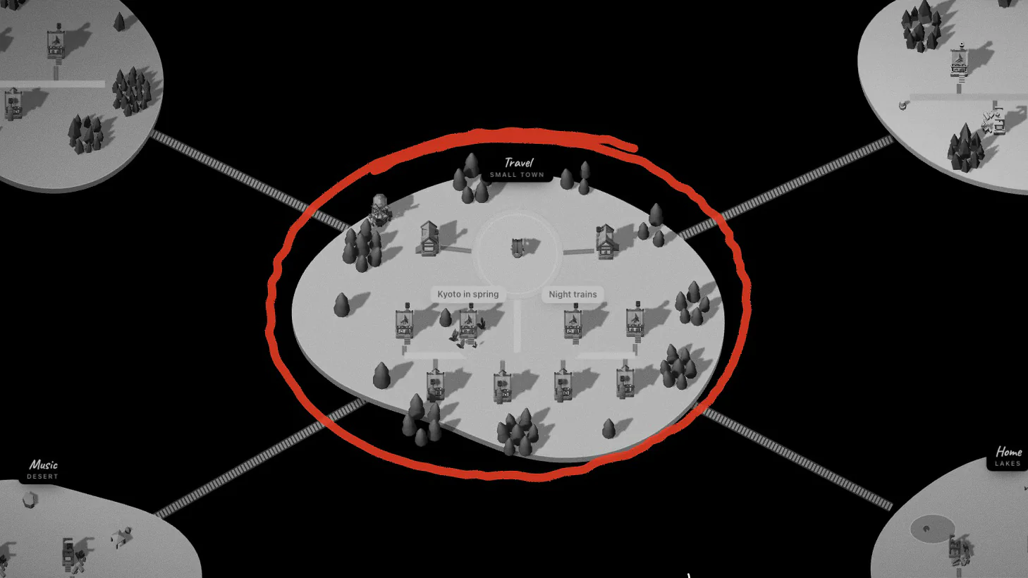
Aloha opens your vault folder and shows it as a small town. Top-level folders become lands, notes become houses, and [[wikilinks]] become roads between their doors. The more links share a stretch of road, the better the road gets (path, road, then paving with lamps), so your busiest connections are visible without a hairball. The layout is stable, so a note stays where it is and you can remember it the way you remember a street.
It sits next to Obsidian rather than replacing it. Your notes stay plain Markdown files on your device; Aloha keeps its map in a single file at the root of the vault, Aloha.canvas, in the same JSON Canvas format, so Obsidian can open the map too. Chrome, Edge and Arc can read and write the vault; other browsers open it read-only. The details — what becomes what, and exactly what Aloha writes — are on Aloha for Obsidian, and the walking itself is in How it works.
In short
- Use the local graph while you write; use the global graph for occasional maintenance, mainly finding orphans.
- Group colours and filters do more than anything else to make the graph readable.
- When you want positions that mean something, use Canvas or a map of content; when you want typed relationships, try ExcaliBrain.
- And if you’d rather walk through your notes than look at them from above, there’s Aloha.